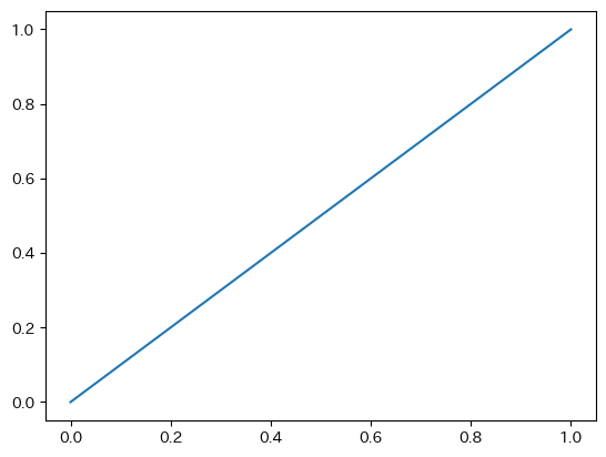
普通に描画する
fig, ax = plt.subplots()
ax.plot([0,1],[0,1])
plt.show()
軸を全て消す。
fig, ax = plt.subplots()
ax.plot([0,1],[0,1])
ax.axis("off")
plt.show()
subplotsを使わない場合はaxのかわりにplt.gca()とする。
plt.plot([0,1],[0,1])
plt.gca().axis("off")
plt.show()

spines、ticks、ticks labelをそれぞれ個別に消す。
fig, ax = plt.subplots()
ax.plot([0,1],[0,1])

# 枠線の制御
ax.spines['bottom'].set_visible(False)
ax.spines['left'].set_visible(False)
ax.spines['right'].set_visible(False)
ax.spines['top'].set_visible(False)
# 目盛りの制御
ax.tick_params(bottom=False, left=False, right=False, top=False)
# 目盛りの数字(ラベル)の制御
ax.tick_params(labelbottom=False, labelleft=False, labelright=False, labeltop=False)

plt.show()
左下の枠線、目盛り、目盛りラベル(数字)を消して、右上に表示させる。
fig, ax = plt.subplots()
ax.plot([0,1],[0,1])

# 枠線の制御
ax.spines['bottom'].set_visible(False)
ax.spines['left'].set_visible(False)
ax.spines['right'].set_visible(True)
ax.spines['top'].set_visible(True)
# 目盛りの制御
ax.tick_params(bottom=False, left=False, right=True, top=True)
# 目盛りの数字(ラベル)の制御
ax.tick_params(labelbottom=False, labelleft=False, labelright=True, labeltop=True)

plt.show()
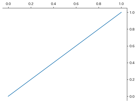
同じことは、xaxis yaxisに対してラベルやtickを制御することでも実現できる。
fig, ax = plt.subplots()
ax.plot([0,1],[0,1])

ax.spines['bottom'].set_visible(False)
ax.spines['left'].set_visible(False)

ax.xaxis.set_label_position("top")
ax.xaxis.tick_top()

ax.yaxis.set_label_position("right")
ax.yaxis.tick_right()

plt.show()

目盛りラベルを、10の累乗表記にするときはScalarFormatterを使う。通常は useMathText=True を使うことが多いだろう。
import matplotlib.pyplot as plt
from matplotlib.ticker import ScalarFormatter

fig, ax = plt.subplots()
ax.plot([10, 20, 30, 40, 50], [1e5, 2e5, 3e5, 4e5, 5e5])

ax.xaxis.set_major_formatter(ScalarFormatter(useMathText=False))
ax.ticklabel_format(axis="x", style='scientific', scilimits=[1,1])

ax.yaxis.set_major_formatter(ScalarFormatter(useMathText=True))
ax.ticklabel_format(axis="y", style='scientific', scilimits=[5,5])

plt.show()

カンマで桁区切りをしたり、明示的に表記を変えたい場合は、matplotlib.ticker.FuncFormatterを使う。
import matplotlib.pyplot as plt
from matplotlib.ticker import FuncFormatter

fig, ax = plt.subplots()
ax.plot([1e1, 1e2, 1e3, 1e4, 1e5], [1e1, 4e2, 9e3, 16e4, 25e5], marker="*")

ax.set_xscale('log')
ax.set_yscale('log')

def com_sep_formatter(x, pos):
    return "{:,}".format(int(x))

def scientific_formatter(x, pos):
    expo = int("{:e}".format(x).split("e")[1])
    base = float("{:e}".format(x).split("e")[0])
    return "{}$\\times 10^{}$".format(base,expo)

ax.xaxis.set_major_formatter(FuncFormatter(com_sep_formatter))
ax.yaxis.set_major_formatter(FuncFormatter(scientific_formatter))

plt.show()